Whenever I attend artist demonstrations, I always take a particular interest in analyzing their color palettes. Color choice is unique to each artist and often becomes something that distinguishes and defines their work. One of my favorite contemporary artists, Alvaro Castagnet, famously uses bright red in many of his urban scenes and is known as "The Passionate Painter". Red is not only arguably the boldest color to put to canvas or paper, it always seems to carry a lot of emotion and in some cultures, even luck! On the cooler end of the spectrum, ultramarine blue historically was very expensive and rare, so artists reserved it for only the most important figures in their work, such as the Virgin Mary in biblical scenes. Luckily this pigment is far more accessible and affordable today, as it is one of my favorite colors to use.
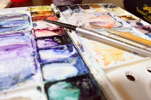
I tend to gravitate towards the cool colors on my palette, with yellows and oranges making their appearance mainly in sunny landscapes. I generally stay away from red as I find it too "loud" for most of my natural northwest scenes. I exclusively use Daniel Smith artist grade watercolors because they have very concentrated pigment, and there are so many beautiful colors to chose from. A few of my must-have colors that generally get used in every painting include:
- manganese blue hue
- ultramarine blue
- cerulean
- indigo
- carbazole violet
- phthalo turquoise
- phthalo green
- burnt umber
If you're new to painting, a good idea is to start with a warm and cool tone for each primary color (yellow, red, and blue), along with some earth tones like burnt umber and raw sienna. As you start to discover what colors you gravitate towards, you can expand your selection. A lot of artists chose to exclude greens (and sometimes all secondary colors) from their palette and prefer to make their own for each application. While there is absolutely nothing wrong with this practice, my own preference is to include a few greens, as sometimes it is impossible to mix a certain bright green or orange hue with primary colors available.
Color is a true gift to the senses and, as an artist, a wonderful spectacle to observe and interpret. My palette is ever changing, how lucky we are to live in an age with so many choices!
 RSS Feed